Shaping Future Brands. Elevating Your Strategy.
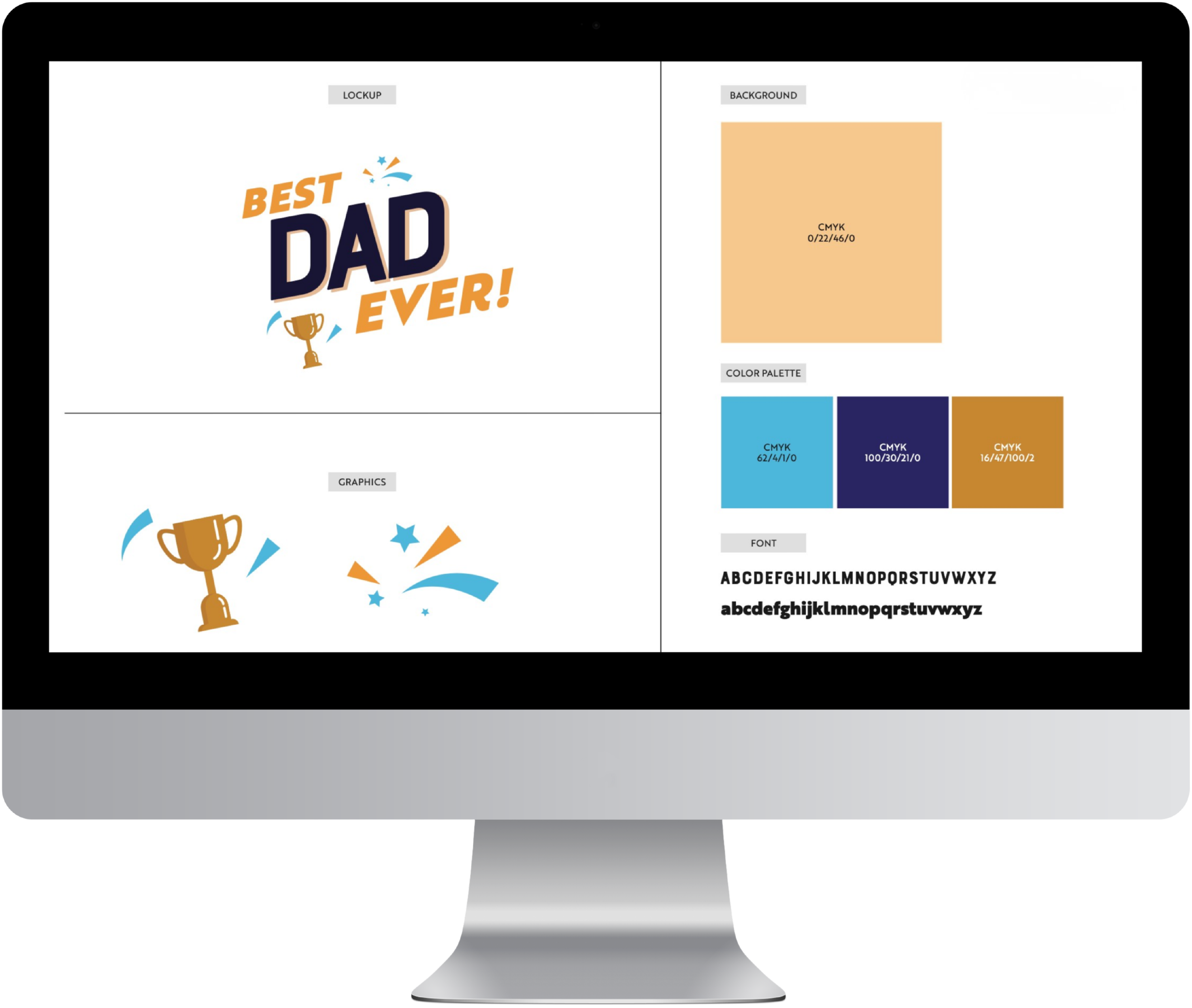
Fathers Day
Overview
To promote Father’s Day, the client needed bright, fun branding that would help drive sales for the annual celebration. This year, they leaned into a bold “Best Father” theme, incorporating trophy motifs and vibrant colors to spark excitement and create a strong incentive to shop. The refreshed look brought energy and playfulness to the campaign, making the promotion feel festive, engaging, and gift‑worthy.
My Role
Creative Client Service Supervisor
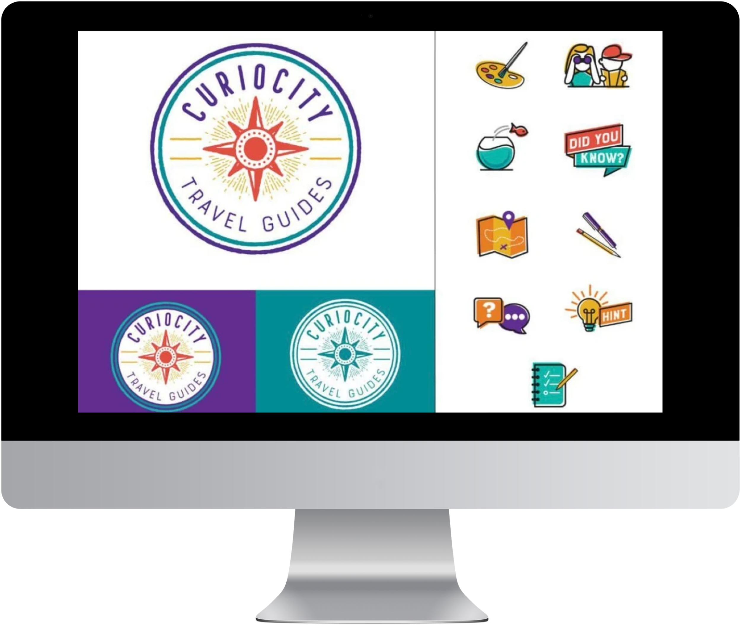
Curiocity
Overview
This joyful client, a seasoned professional in international travel, set out to build a business that helps youth engage more deeply with their surroundings while exploring abroad. They envisioned a brand that felt sketched, kid‑friendly, and vibrantly colorful—something that sparked curiosity and encouraged interaction. To bring that vision to life, we created a set of playful icons to pair with each activity section, giving kids visual cues that made the experience more intuitive and fun. The result was a creative system rooted in youthful exploration, travel‑inspired storytelling, and bright, approachable design.
My Role
Account Manager
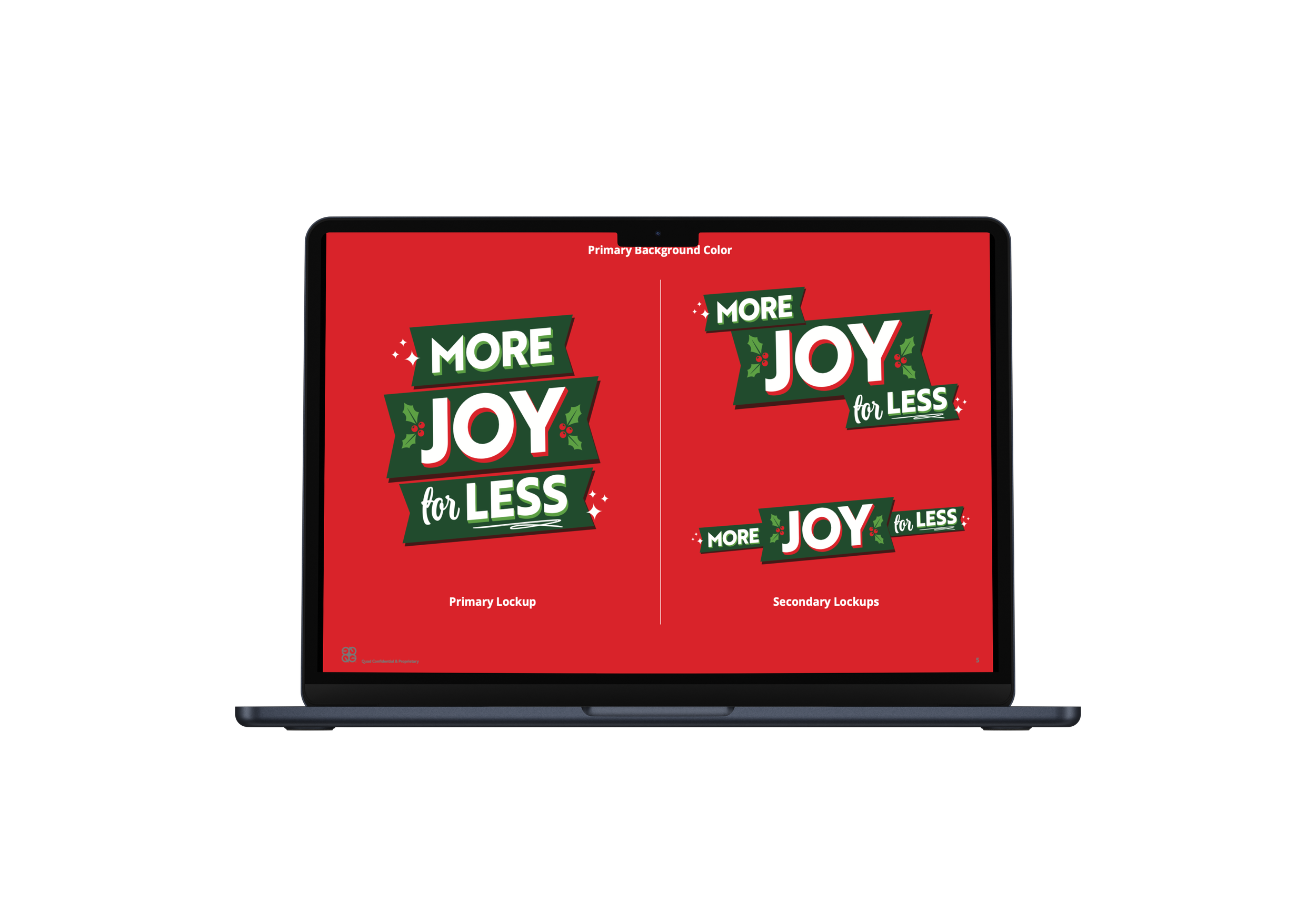
Holiday 2025
Overview
This holiday season, the client wanted a joyful branding direction that blended tradition with a fresh, modern twist. The look leaned warm, celebratory, and community‑focused as well. The overarching goal was to make “More Joy, Less Spend” feel like an authentic invitation to create beautiful memories and not just a sales message by infusing the campaign with holiday warmth, modern visual energy, and community‑centered storytelling.
My Role
Creative Client Service Supervisor
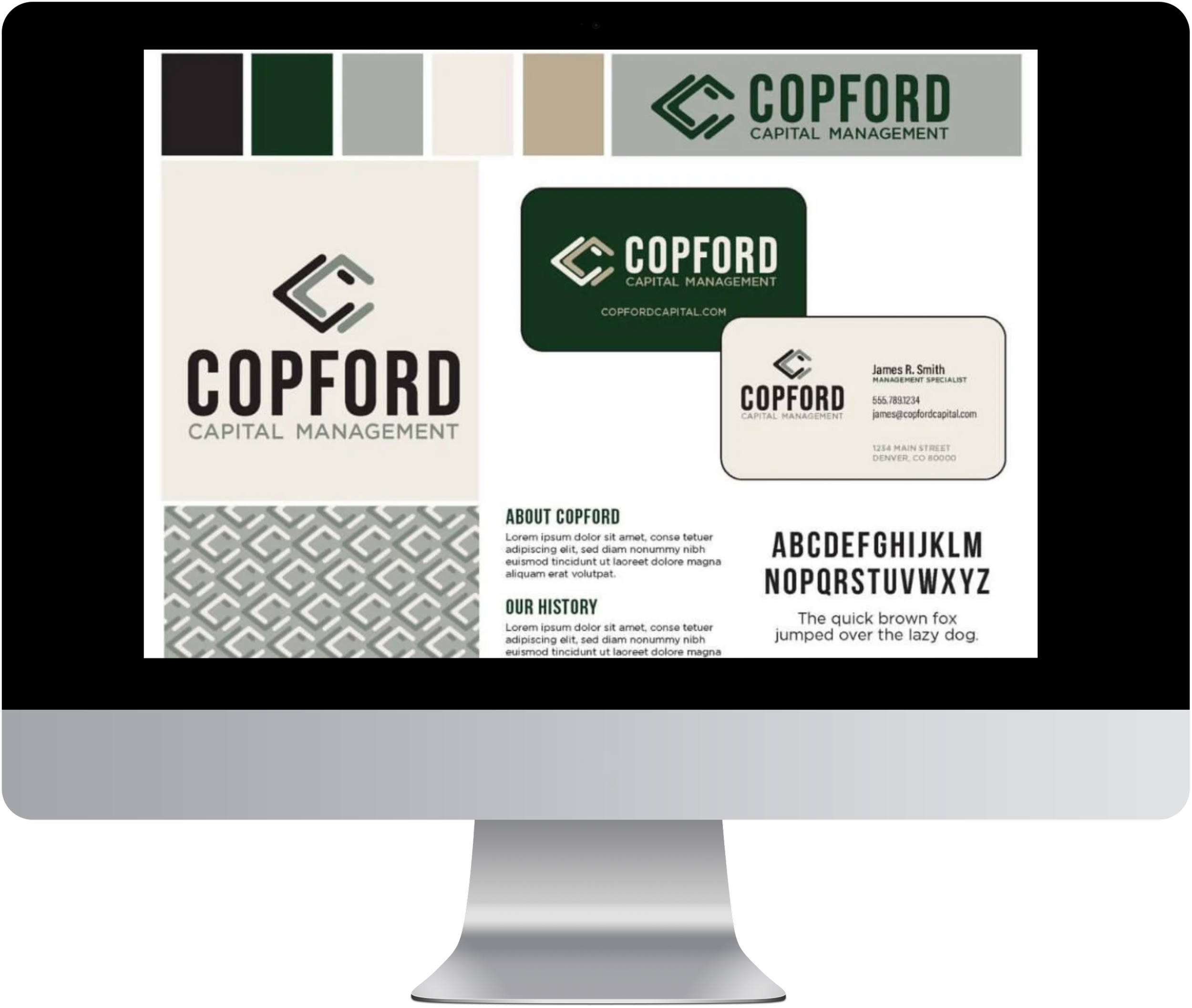
Copford Capital Management
Overview
The client wanted a clean, elevated logo and color palette that felt expensive and refined while remaining easy to read across all applications. The goal was to establish standardized colors that could adapt seamlessly to any environment, ensuring consistency no matter where the brand showed up. By focusing on clarity, versatility, and a premium aesthetic, we delivered a visual identity that felt both timeless and highly functional.
My Role
Account Manager
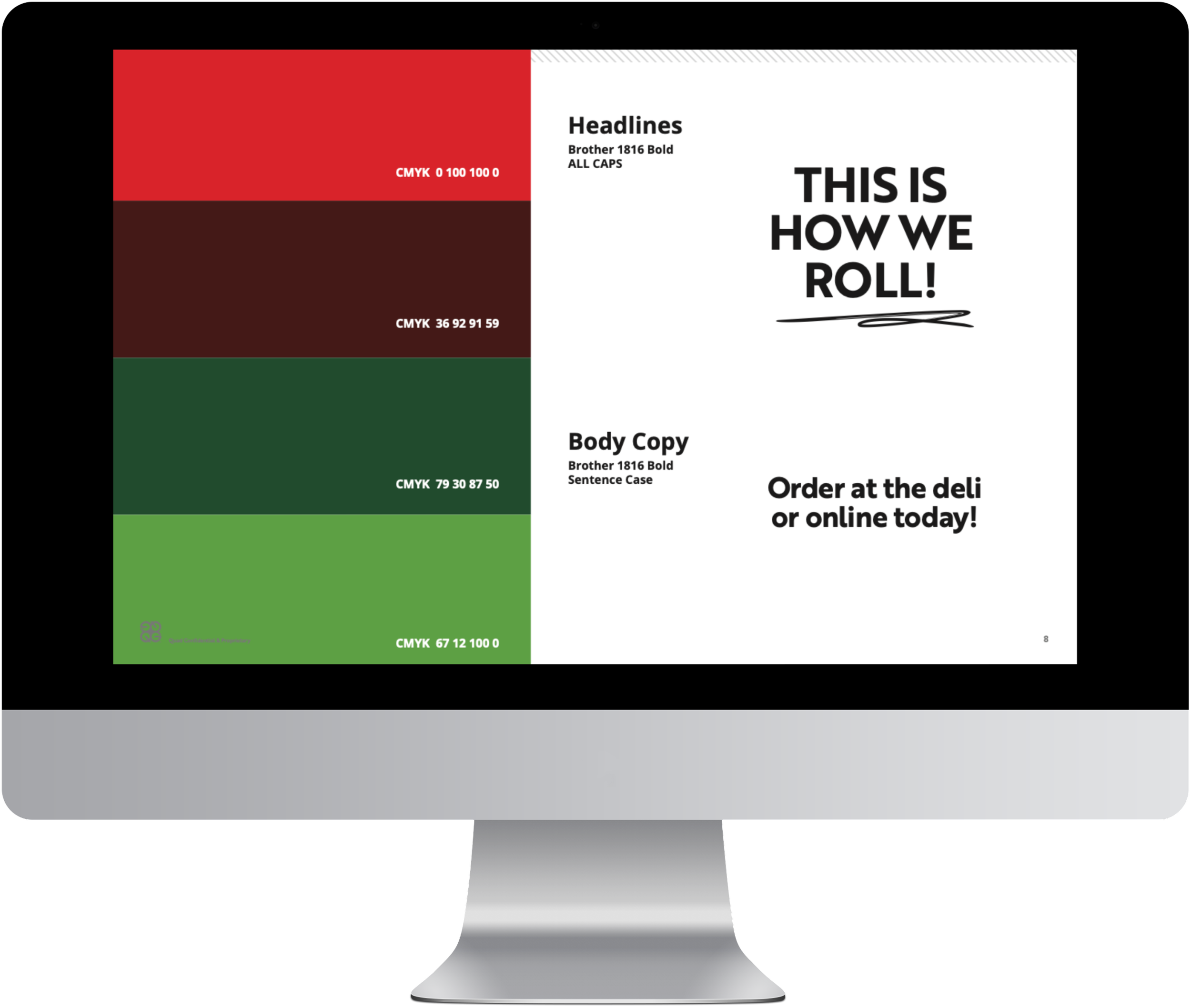
Superbowl 2025
Overview
The client needed a sporty, on‑brand creative direction to support sales around the Super Bowl, aiming for something fun, energetic, and unmistakably seasonal. They wanted a classic football aesthetic brought to life through bright red tones, clean textures, and a polished look that still felt bold. Our goal was to make the design signal football subtly, balancing thematic cues with brand consistency to create a campaign that felt festive, modern, and game‑day ready.
My Role
Creative Client Service Supervisor

*The content, images, and designs displayed on the website are presented for demonstration and example use only.These works are property of their respective clients or copy write holders.I do not claim ownership of the final works, and they should not be reproduced, distributed, or used without explicit permission. Any confidential or proprietary information has been redacted or anonymized to respect client privacy and agreements.